01
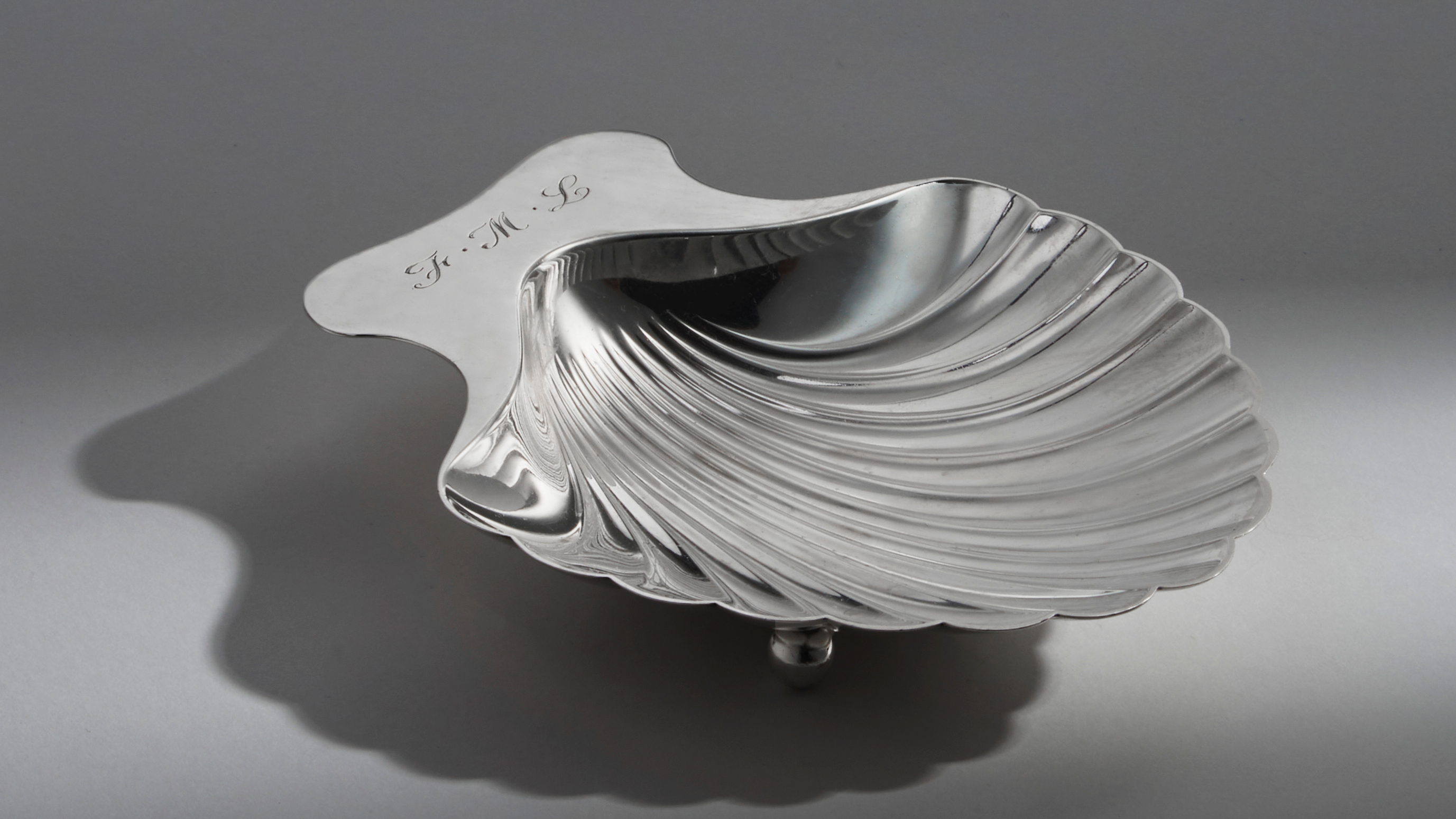
MISC represents my effort to explore new formats beyond the computer.
MISC is my personal jewlery practice, See more at: https://miscjewelry.info/
Creative Direction, Package Design, Art Direction, Web Design, Typography, Ongoing Project
![]()
![]()
![]()


02
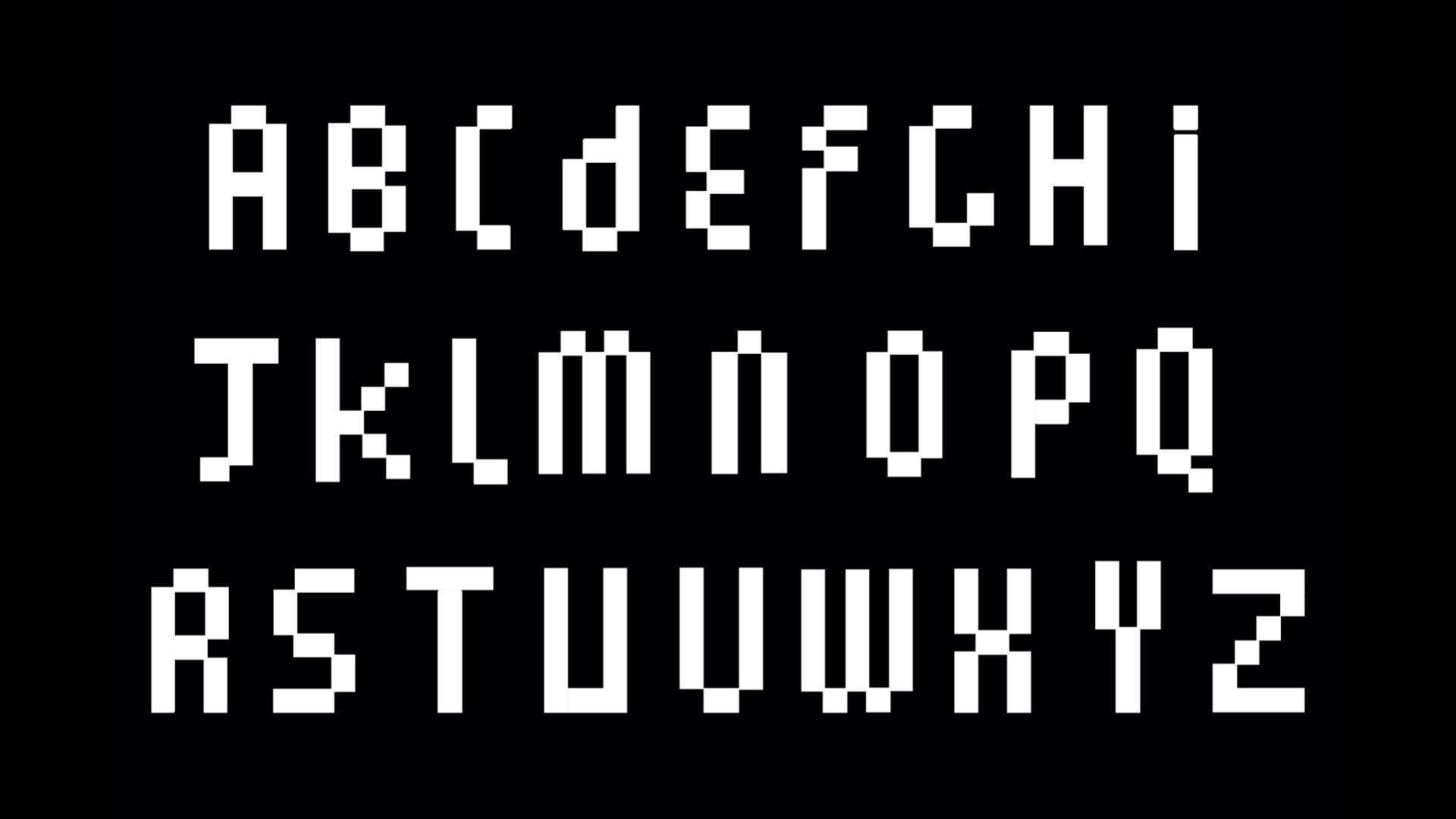
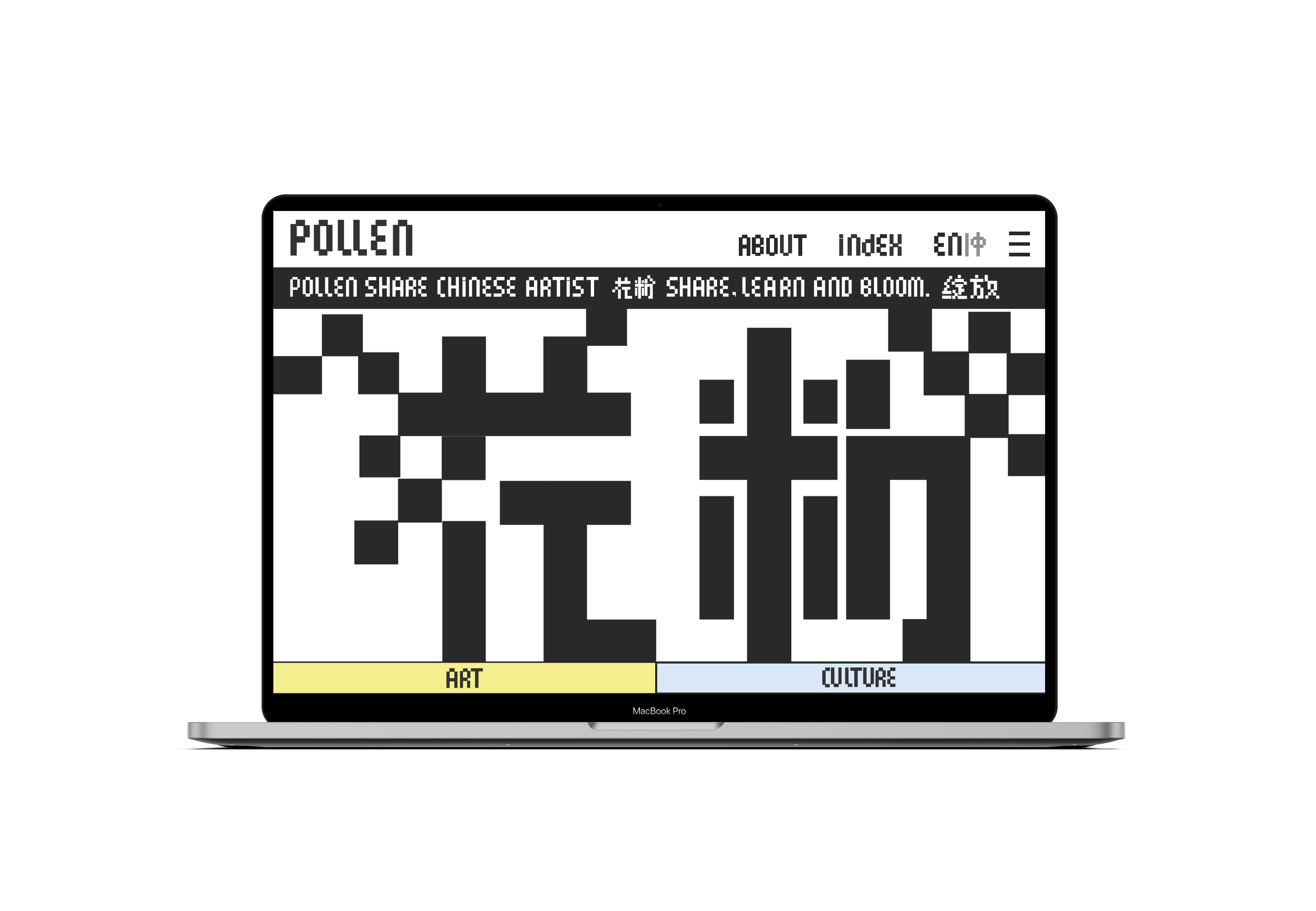
Pollen is an editorial platform highlighting the emerging art, creativity, and culture in Chinese and Chinese American communities.
Branding Identity. Creative Direction. Motion Design. Typography.Ongoing.
![]()
![]()
![]()
![]()
![]()



03
BMW China for the year of tiger.
Client BMW China
Creative Agency Real Good Studio
Creative Direction Jonah Gabriel
Art Direction Sam Hochman
Editing BRTHR
Music Tomás Tomás
Production Rosa Palmeri, Anne-Marie Halovanic
Featured Artists:Pablo Rochat, Conner Griffith, Christopher Rutledge, Loulou João, Alexandre Louvenaz,
Kensuke Koike, Mike Manor, Sarah Hopp, Tom Goulet, Danaé Gosset, Tina Nawrocki, Blunt Action, Nathan Motzko, Sam Hochman
2D Animation: Tom Goulet, Rachel Kim, Mackenzie Katz
3D Animation: Yasmin Islas, Rodrigo Hernández, Rachel Kim, Alexandre Louvenaz, Mackenzie Katz, Josh Burke,
Mikey Kelly, Subin Krishna, Danesh Taraporevala,
Design: Leah Maldonado, Zak Tebbal, Bingbing Zhang, Suzie Komza
04
Adidas
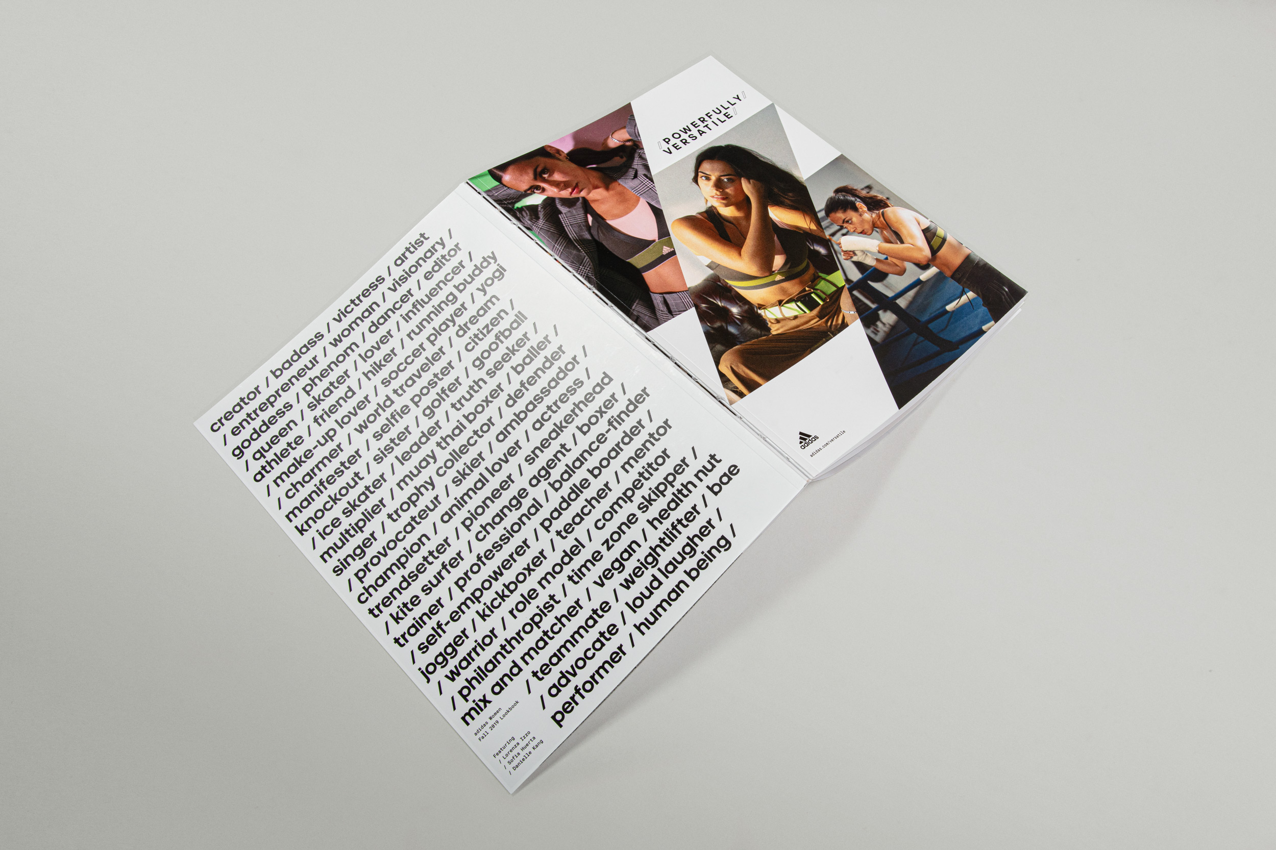
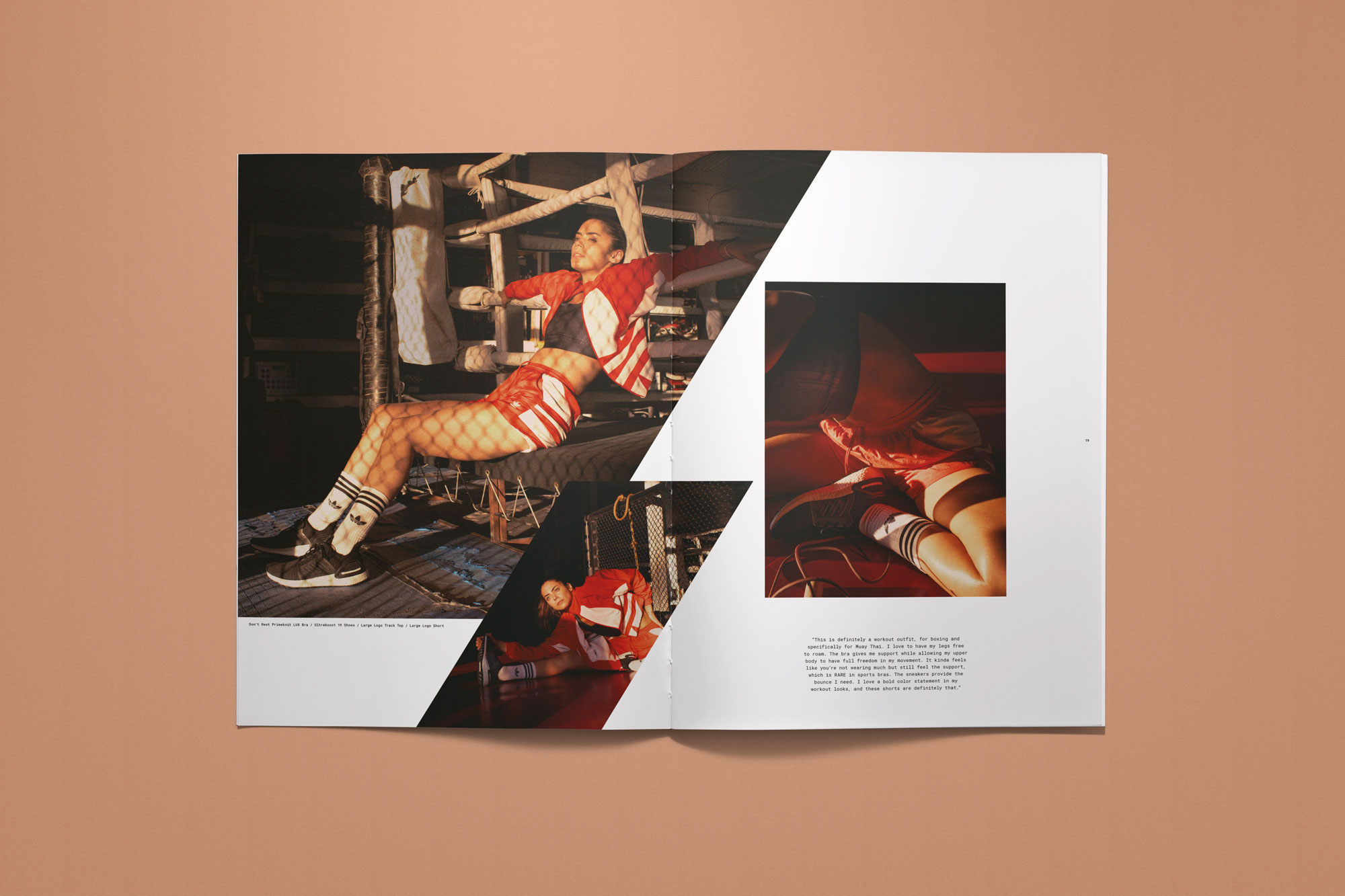
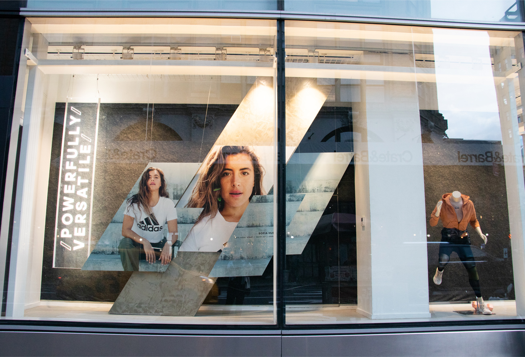
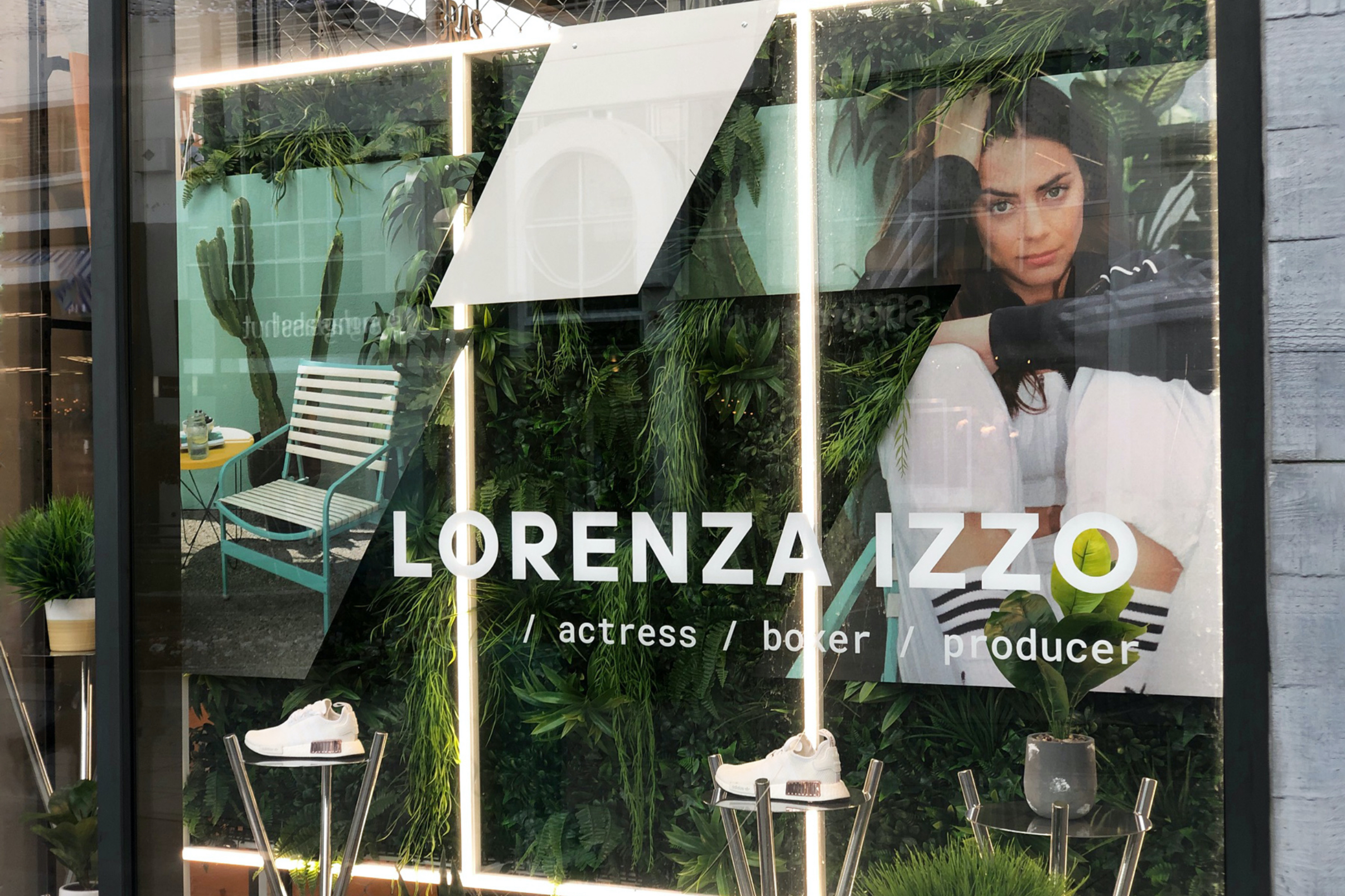
Powerful women need versatile cloths. The mission of this project is to reflect real women’s shopping patterns by integrating adidas’ three separate women’s lines for the first time, across all adidas platforms, in retail, print, digital, and social.
Work with the team at Red&Co Portland
Typography. Store Front Deisign. Social Media. Branding.
![]()
![]()
![]()
![]()
![]()
![]()


05
Scorpius is a typeface that took inspiration from all the fragile but tenacious things in life. The letter form has come extremely sharp and pointy because that just the way how fragile things in life protect themselves. Letter form also have a rather big center to prominent the airiness of the letter form itself. It gave birth to a sans serif typeface which is characteristically sharp and extreme.
Scorpius also is characterized by its’ low contrast in the overall letter form. Arms and shoulder are smoothly connected to the stems and strokes then end at a sharp, pointy ends.
Type Deisgn.
![]()
![]()
![]()
![]()
